Designage
the age of designArchive for color
ommmm-bre
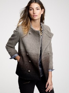
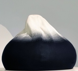
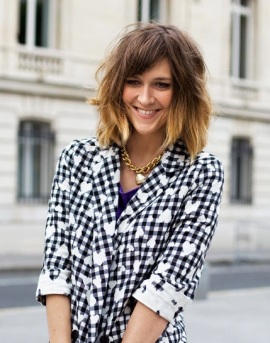
this trend has been around for awhile (in fact, wethinks it graced the pages of ye olde dominoe once upon a time) but it’s come full circle, with outerwear, children’s accessories, and hair, respectively.
horizon coat from j. crew
mountain beanbag from smallable
daphne, shot by garance doré
though, let’s be honest, nothing beats the gradient radiator.
redefine: tiffany blue
did you know… pantone has designated tiffany’s signature robin’s egg blue as pantone 1837, based on the year the store was founded and not their typical color spectrum and numbering? wild. we wouldn’t go overboard with anything turquoise-related, but a few touches here and there are punchy:


jaune redux
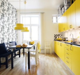
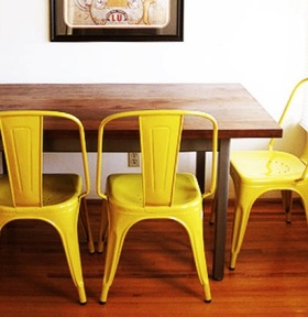
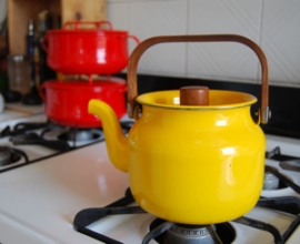
wethinks ’tis time for another post on old yeller. this time, with a marigold twist. let’s hit it:

.gif)
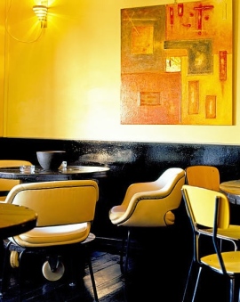
feel this deal

ferm living wallpaper on sale – including the elegant, icy turquoise featured here for $115 a roll.
long winter’s nap
say what you will about anthropologie (price markups, the president’s politics), the boho chain does occasionally reduce some of their big-ticket items, bringing them back into the realm of responsible home decorating. take, for example, the chinoiserie bed:
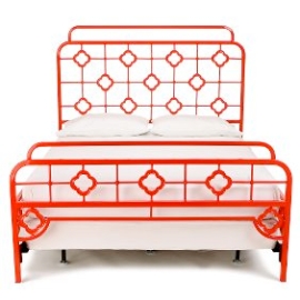
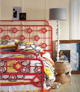
in red, of course.
prop stylist
this seems like the perfect job, no? selecting just the right tchotchke (or lack thereof) to make or break a room. some examples below:

toy trucks and mini furniture.

modern lucite + old fashioned floral arrangement and toile.

the perfect cane chair and rustic basket of logs.

a casually “made” bed and good use of color and negative space.
bête noire
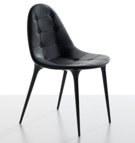
‘neo-goth’ has been floating around fashionista vocabulary for the past few months, and now we’re seeing a similar influence on decor trends. we love the idea of a few black accents to ground a room’s design, just don’t go overboard or your space will look like the lair of cruella de vil.
moody room done right (a “gentleman’s club” in notting hill, london):

color theory

we’re coveting a new line of polish with colors based on an ettore sottsass valentine typewriter, an andy warhol pink, art nouveau teal, and albers-inspired orange, among others. now how’s about an international klein blue?
feel this edificio


we are completely enamored with the facade of this building by gabriel mancera in mexico city – those windows! that flat surface! the neon pink entryway tucked in the corner! more images here at archdaily.
